MP0 Writeup.
Overview
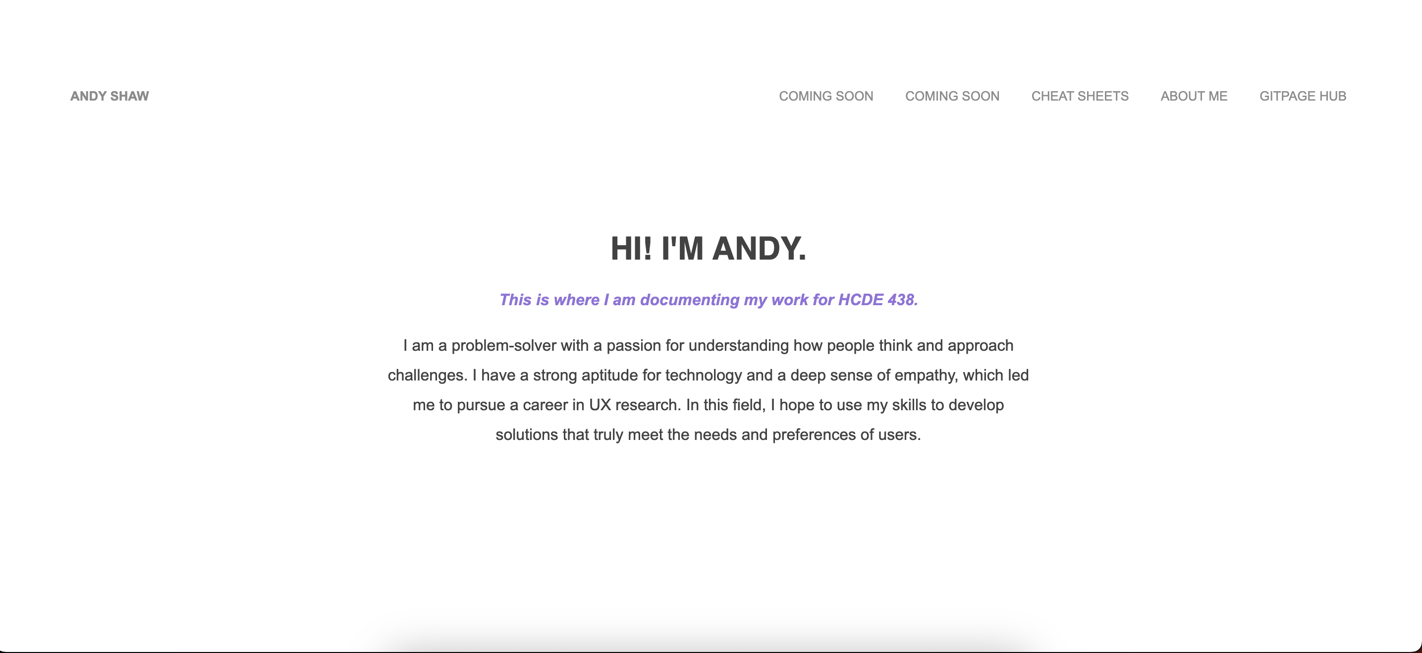
When I was building the website for the portfolio, I went through a lot of
planning to try and figure out what I wanted my theme to look like. This meant finding the
right fonts, colors, sizing, spacing etc. Then I began working on the coding of the navbar
first, since it was going to be present on every page and is arguably the most important thing.
Afterwards, I went from the navbar to designing the homepage, about me page, and finally
the cheat sheets page.

Issue
The most difficult issue I ran into was trying to find out how to put text over an image.
This was extremely difficult since the image was surrounded by a div I was using to help
detect hovers to blur out the image. So, I did a lot of google searching and found similar
methods, but even after trying them out no solutions worked. So I tried playing with the
selectors to see if I could hard code the text with absolute positioning and changing colors,
yet it was unsuccessful. So after 30 minutes of struggling, I decided to make a bootleg solution,
which is still in effect right now. I colored my text white, and when the image is hovered it is
moved there. When the image is not hovered, the white text is floating somewhere randomly on the page
and if you look closely on the homepage and nav bar, you can see where the white text overlaps.
Ideally the text is invisible and doesn't exist until the image is hovered, but this is the
best I can do with my knowledge.
CSS Transition
The CSS transition I made is a hover effect on images on the homepage that blur them. This was I could make my
page seem more dynamic despite not using any Javascript. It also minimalizes the amount of text on the homepage.
I made it work using :hover in CSS with a webkit filter.

Ideas and Future
- Adding resume and contact pages
- Adding an easter egg to play a game like Google dinosaur
- Cleaning up CSS
- API on about me that connects to what I most recently played on Spotify